

 Image 1 of 14
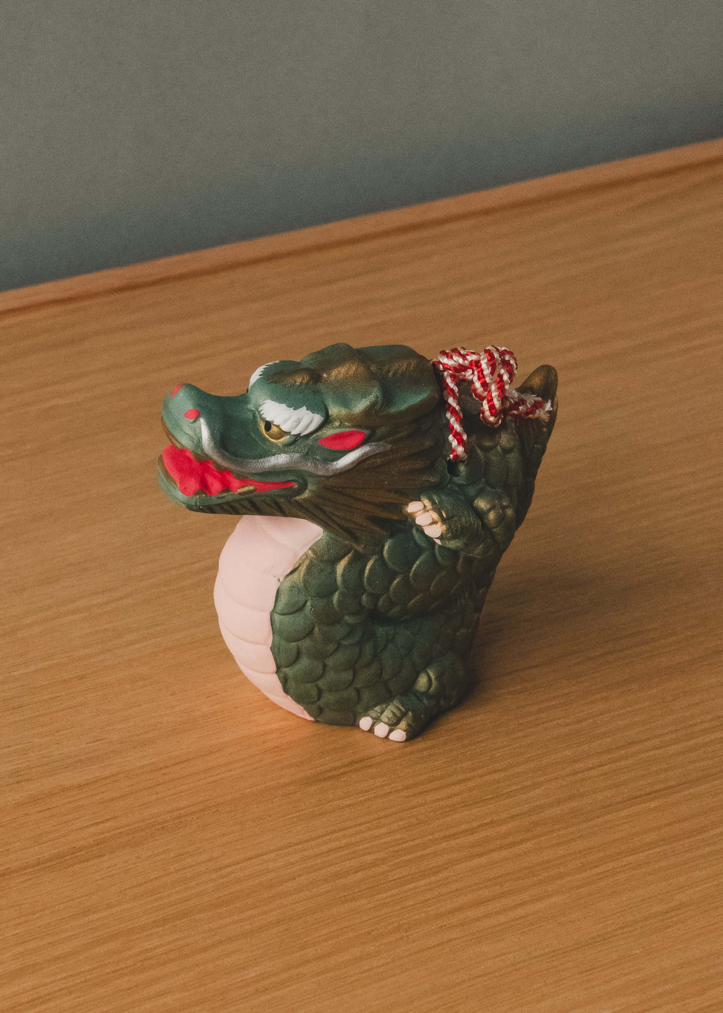 Image 2 of 14
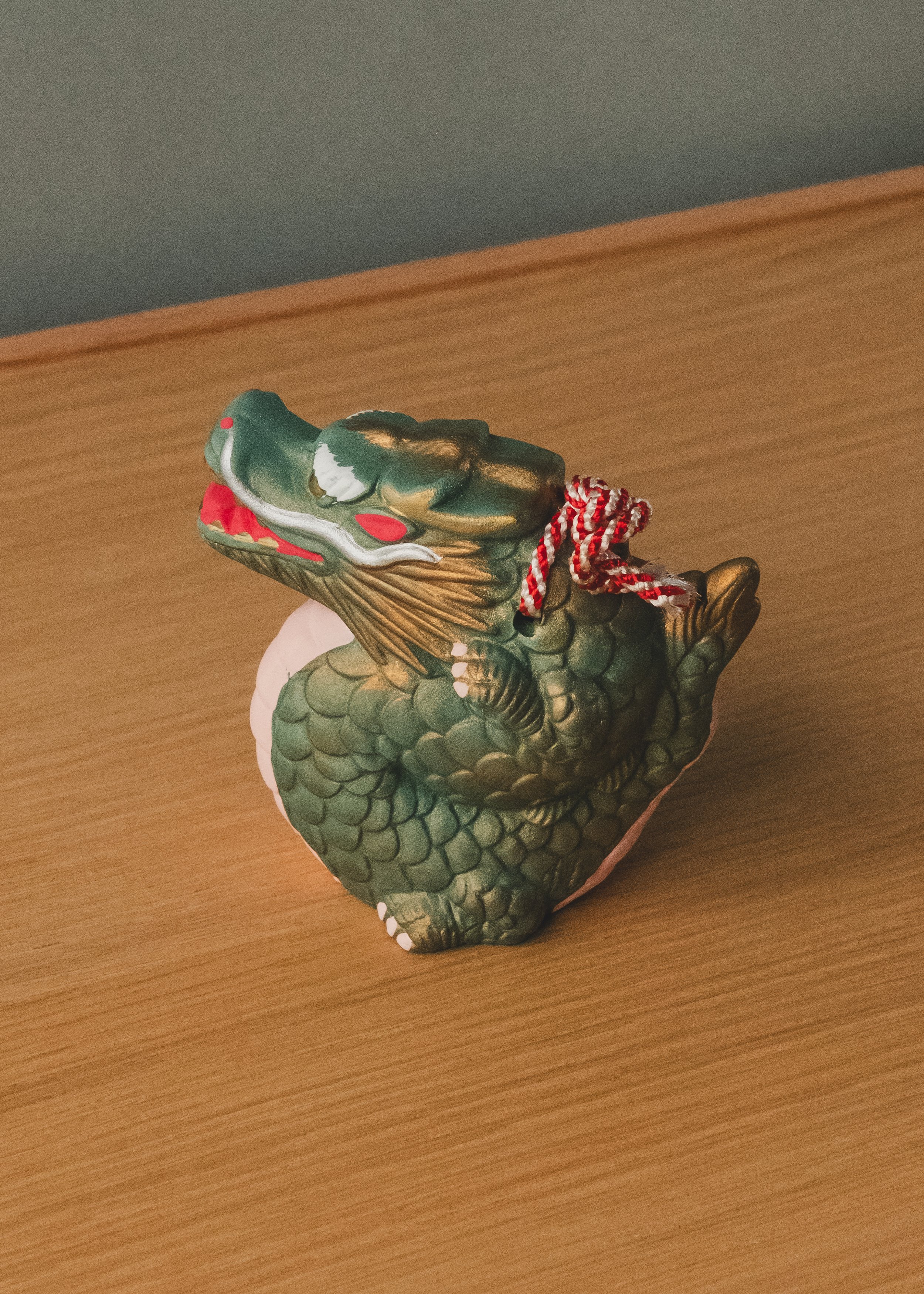 Image 3 of 14
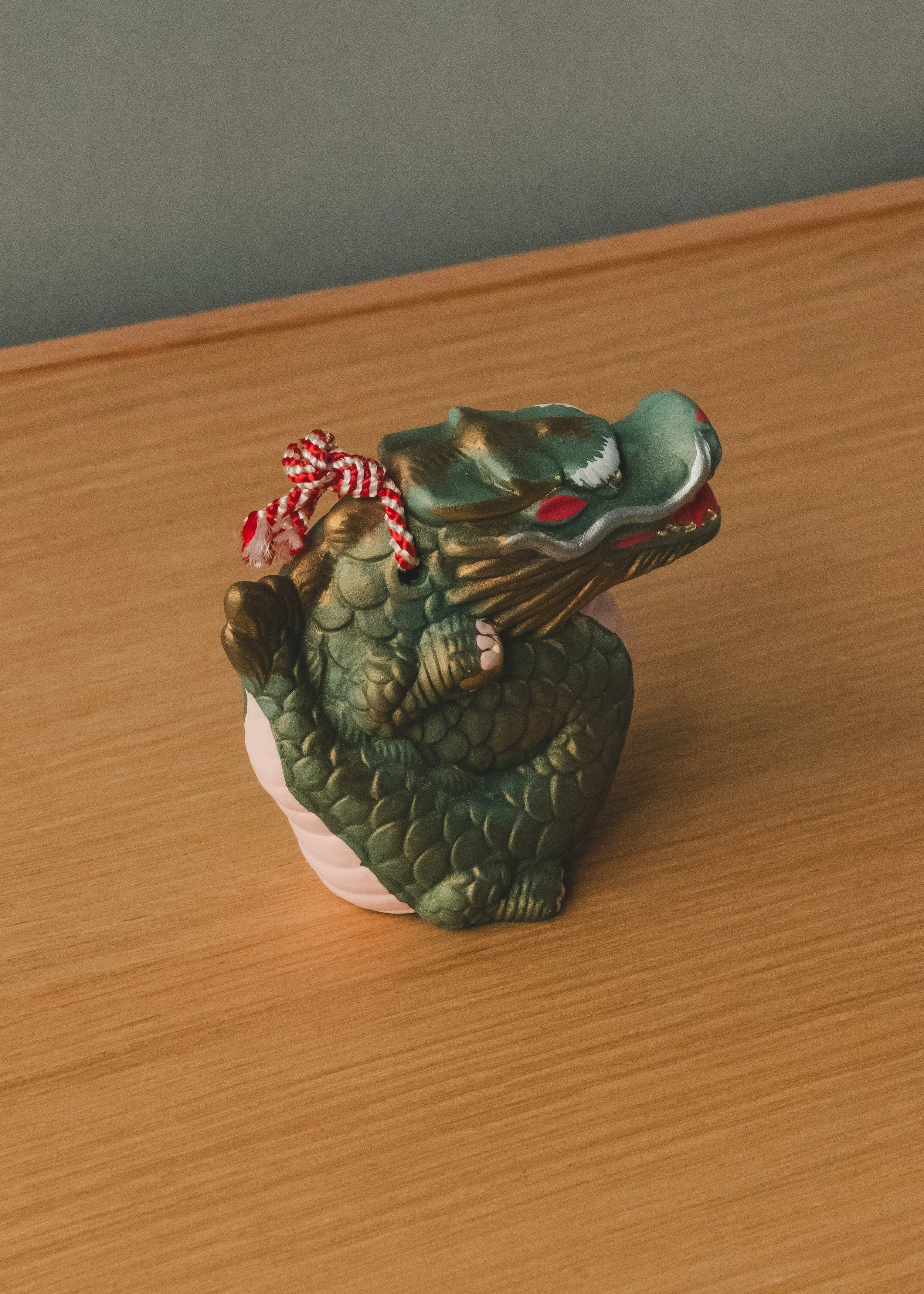 Image 4 of 14
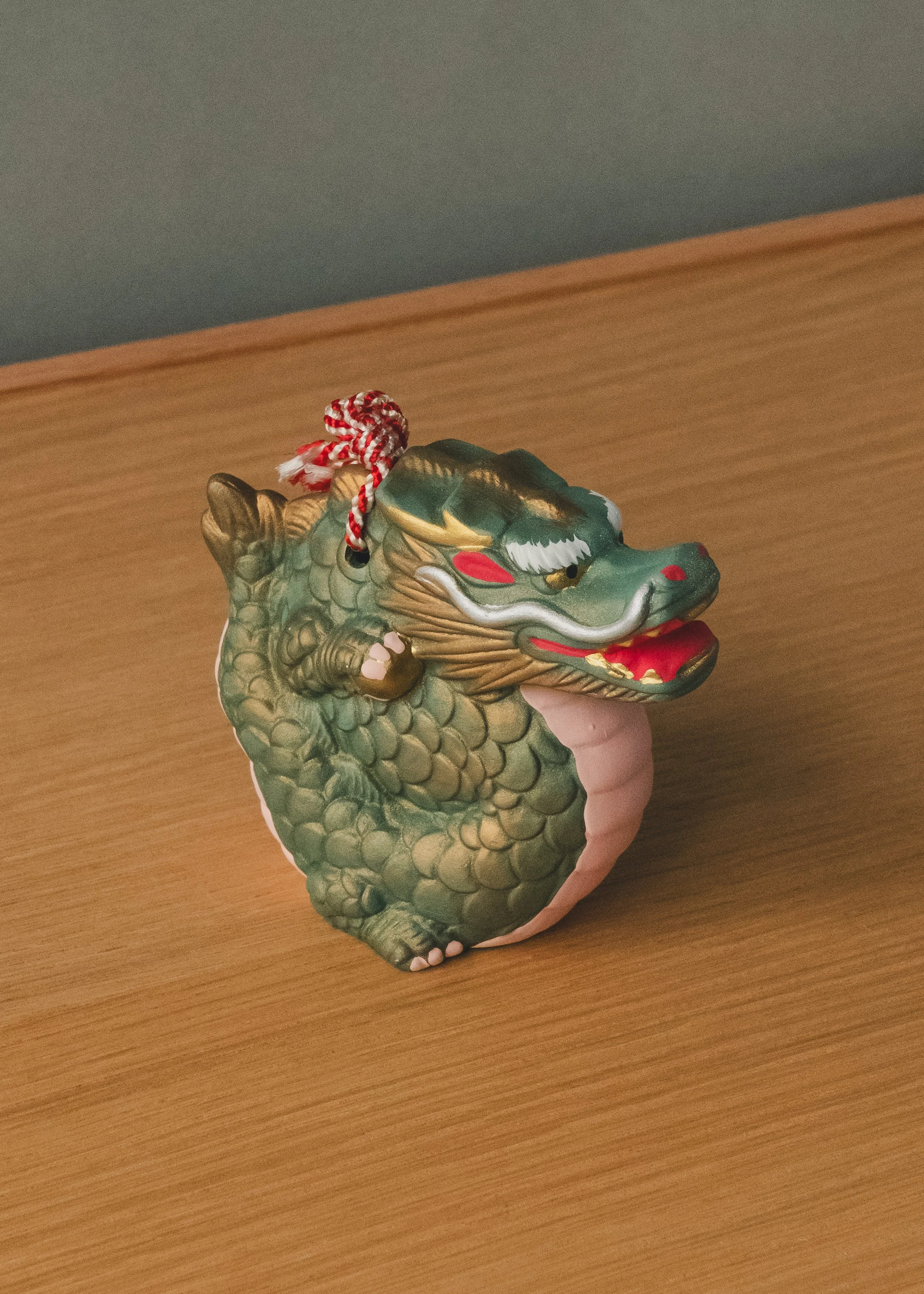 Image 5 of 14
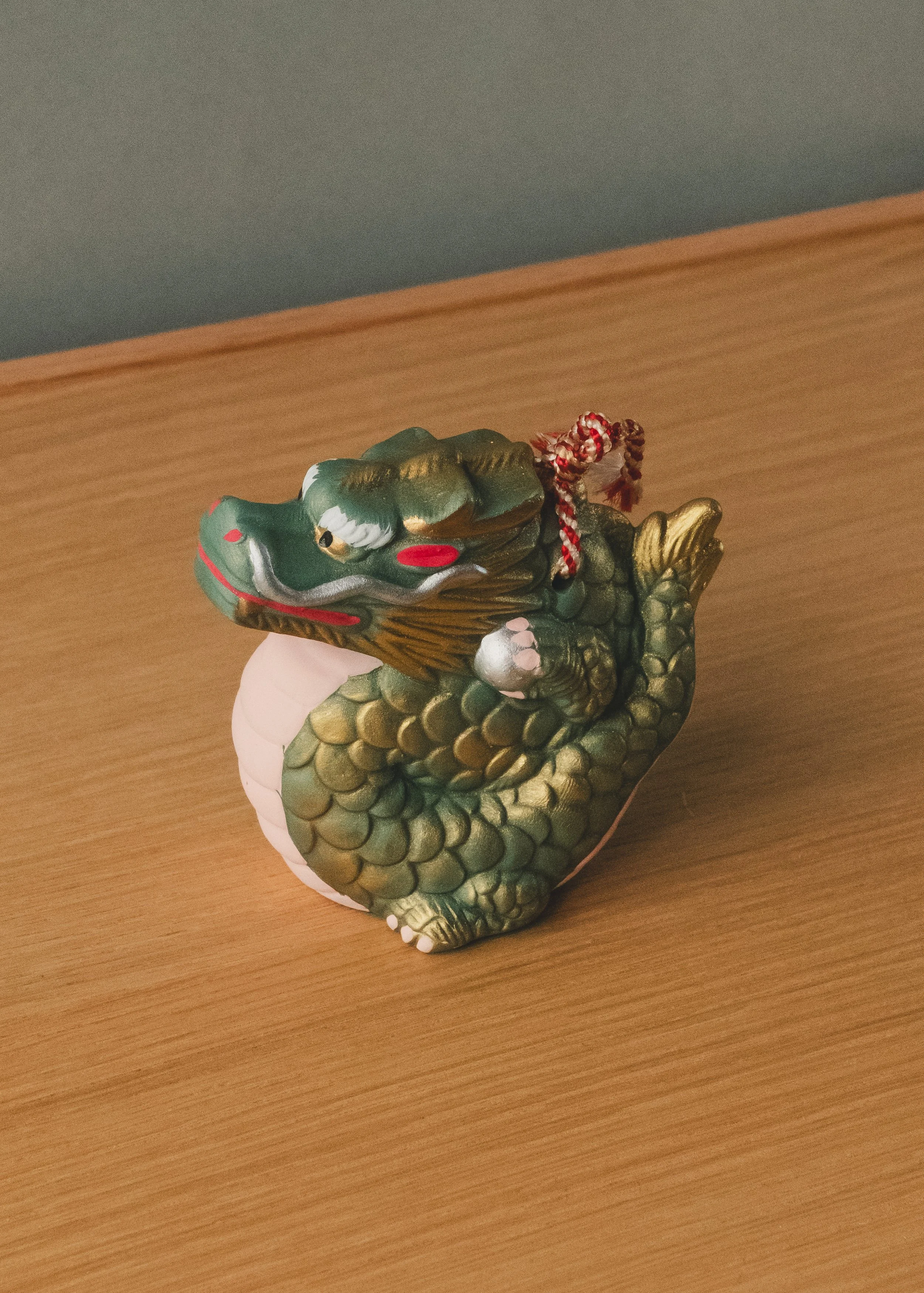 Image 6 of 14
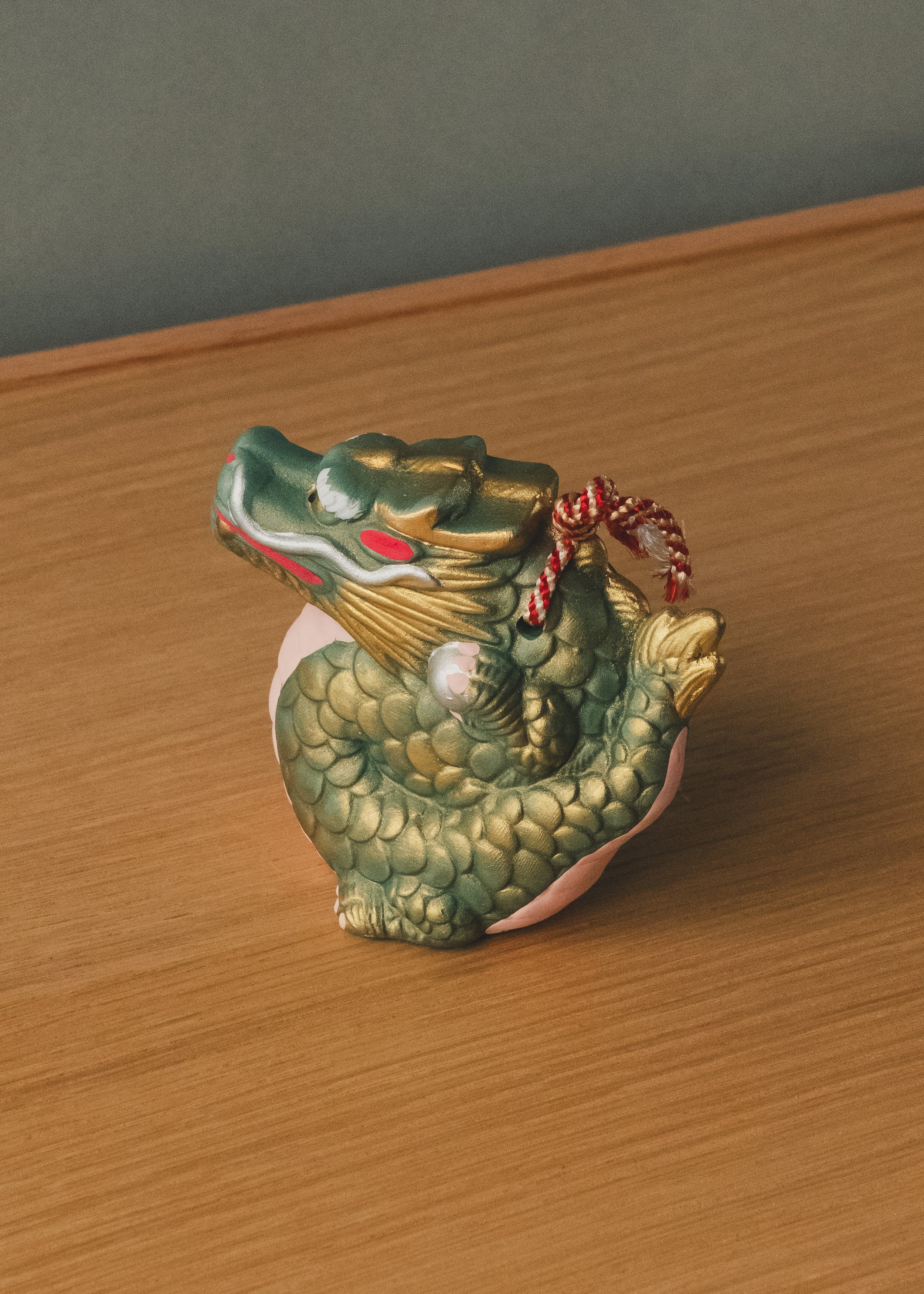 Image 7 of 14
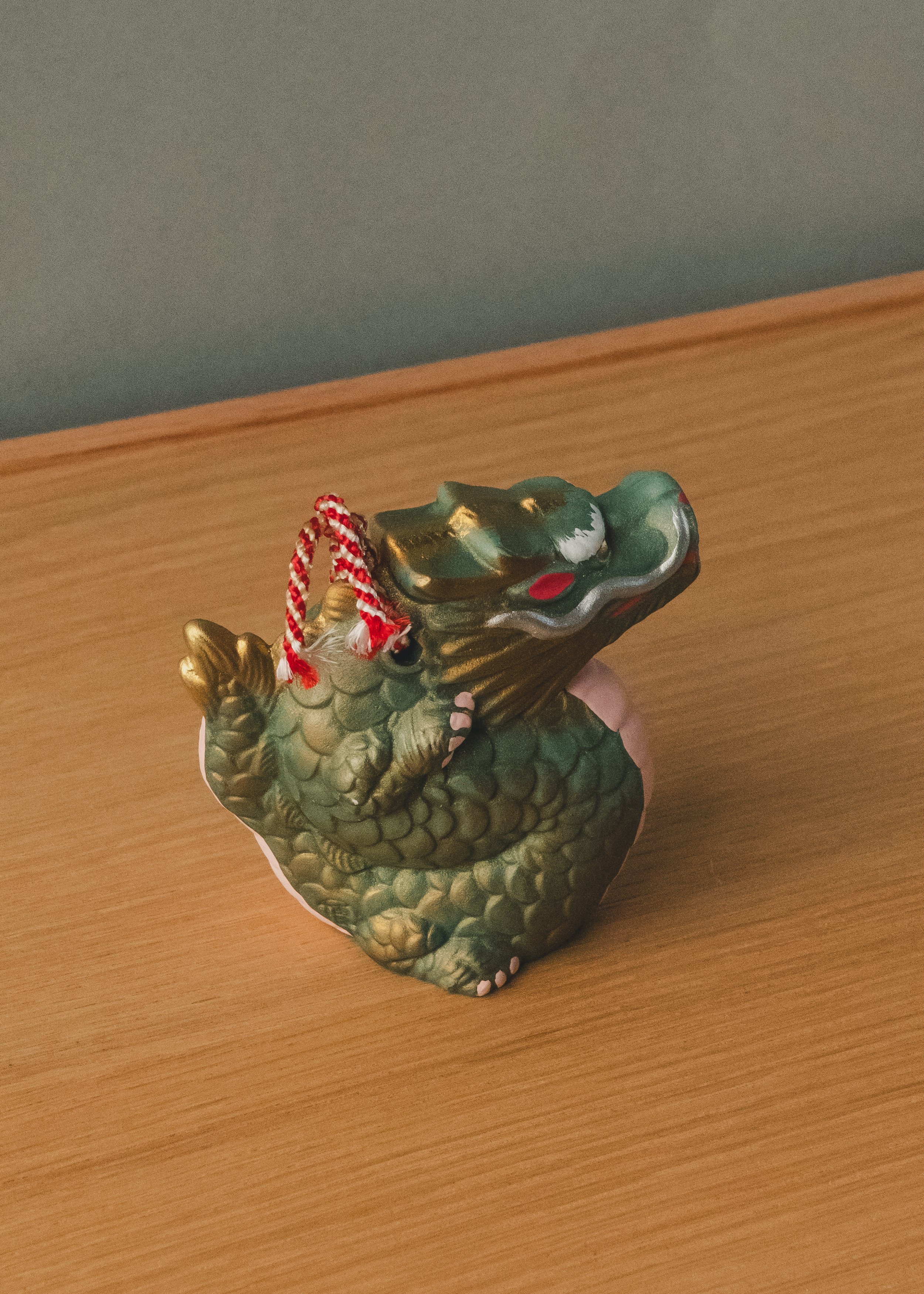 Image 8 of 14
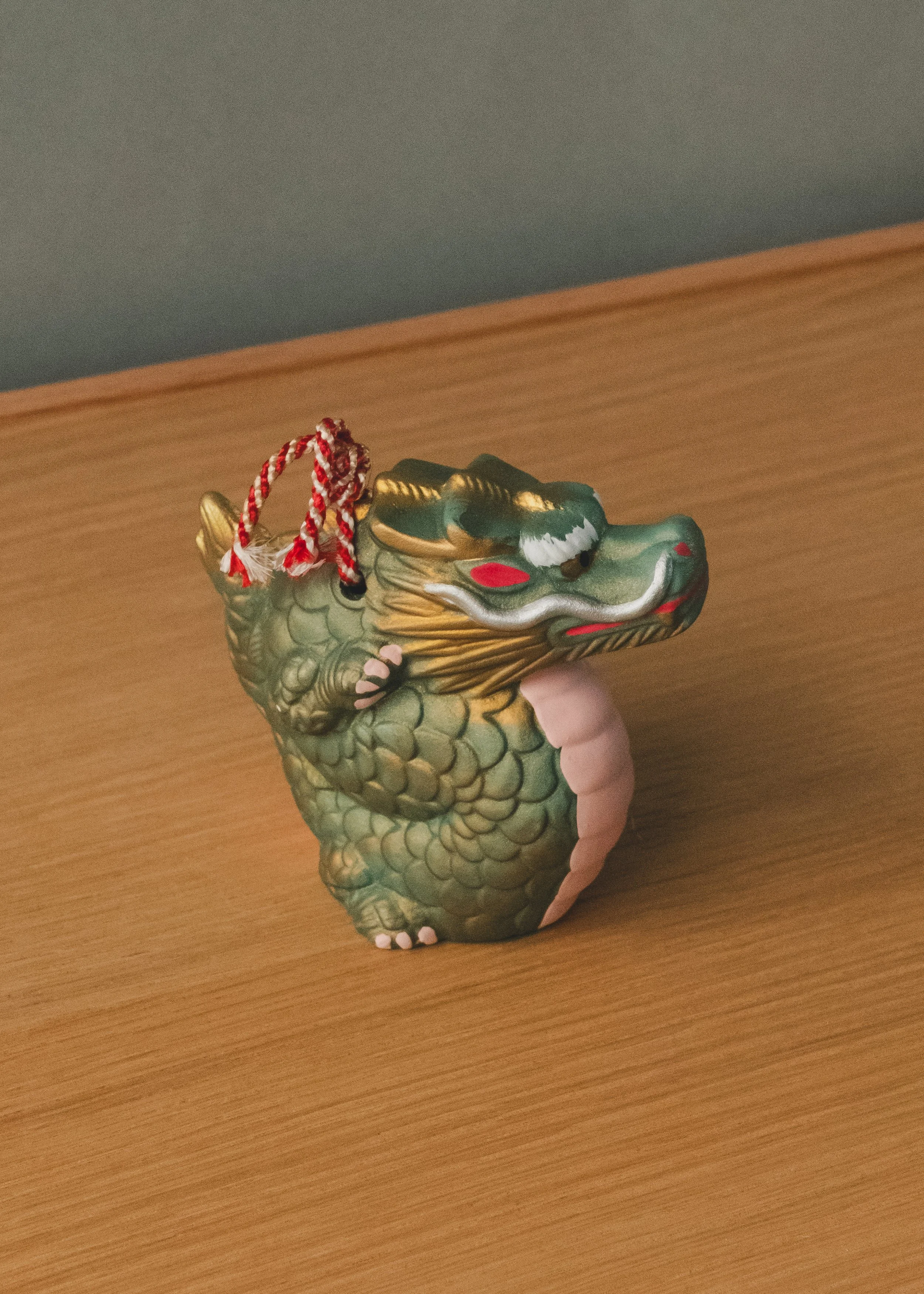 Image 9 of 14
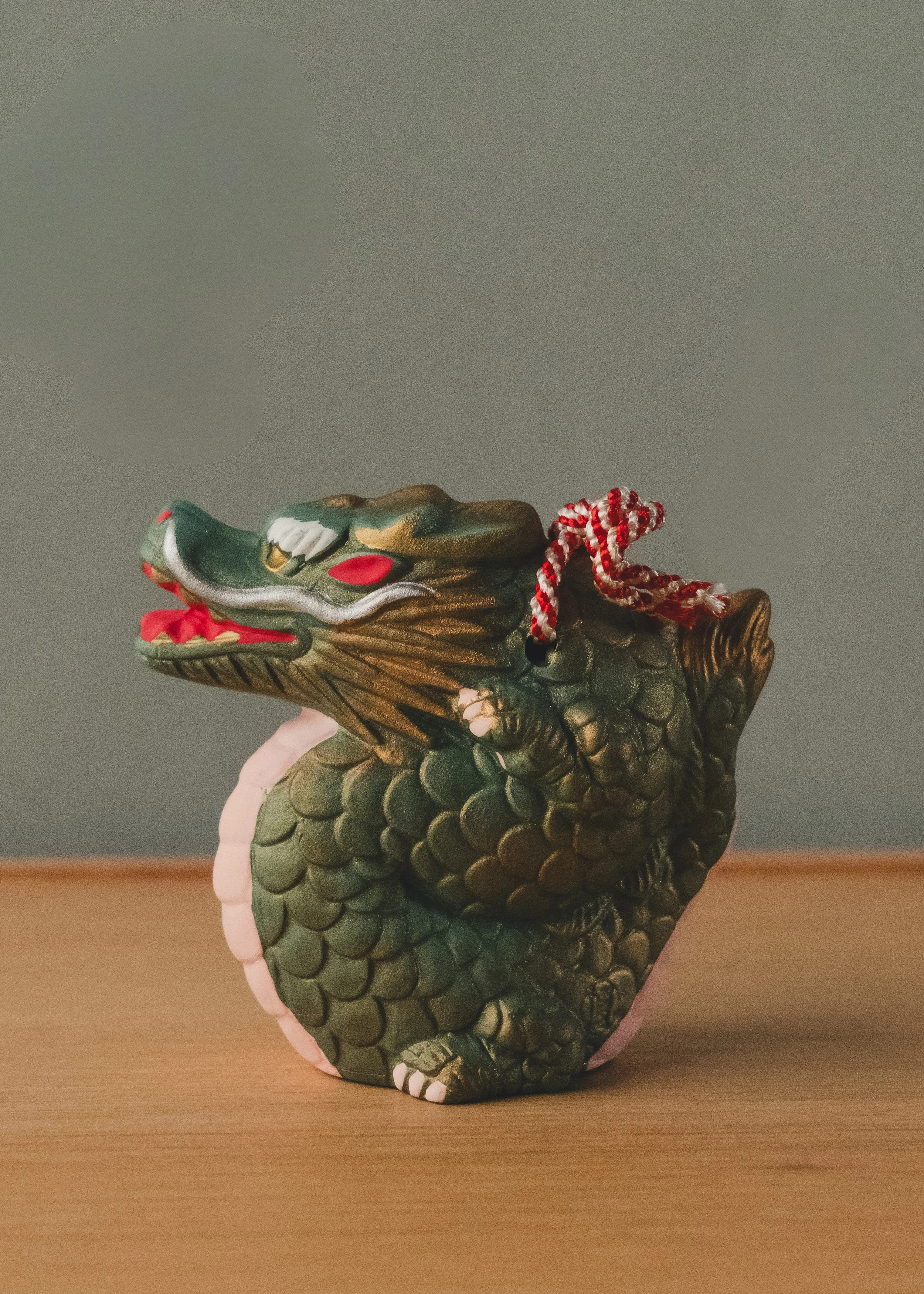 Image 10 of 14
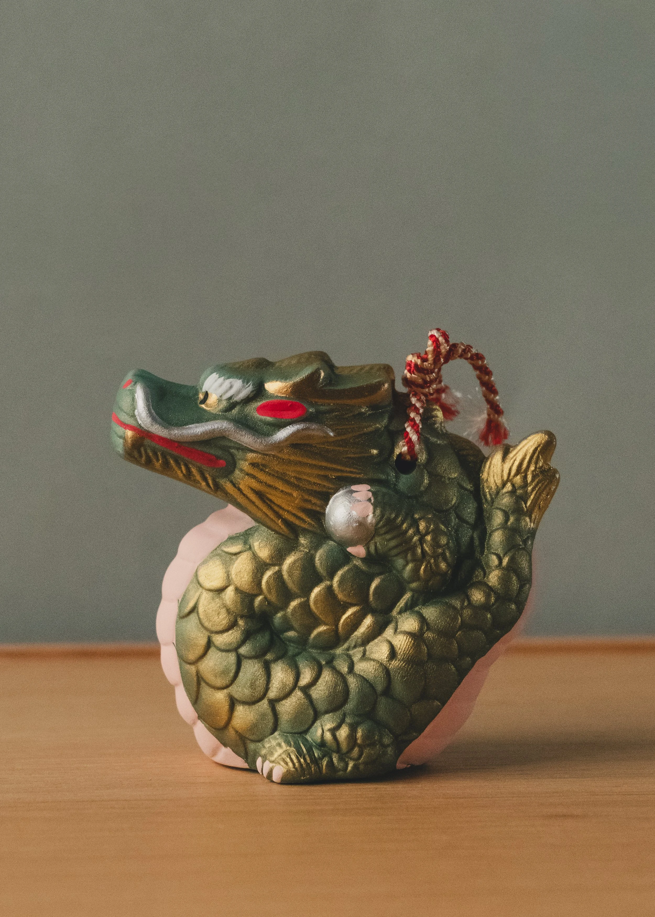 Image 11 of 14
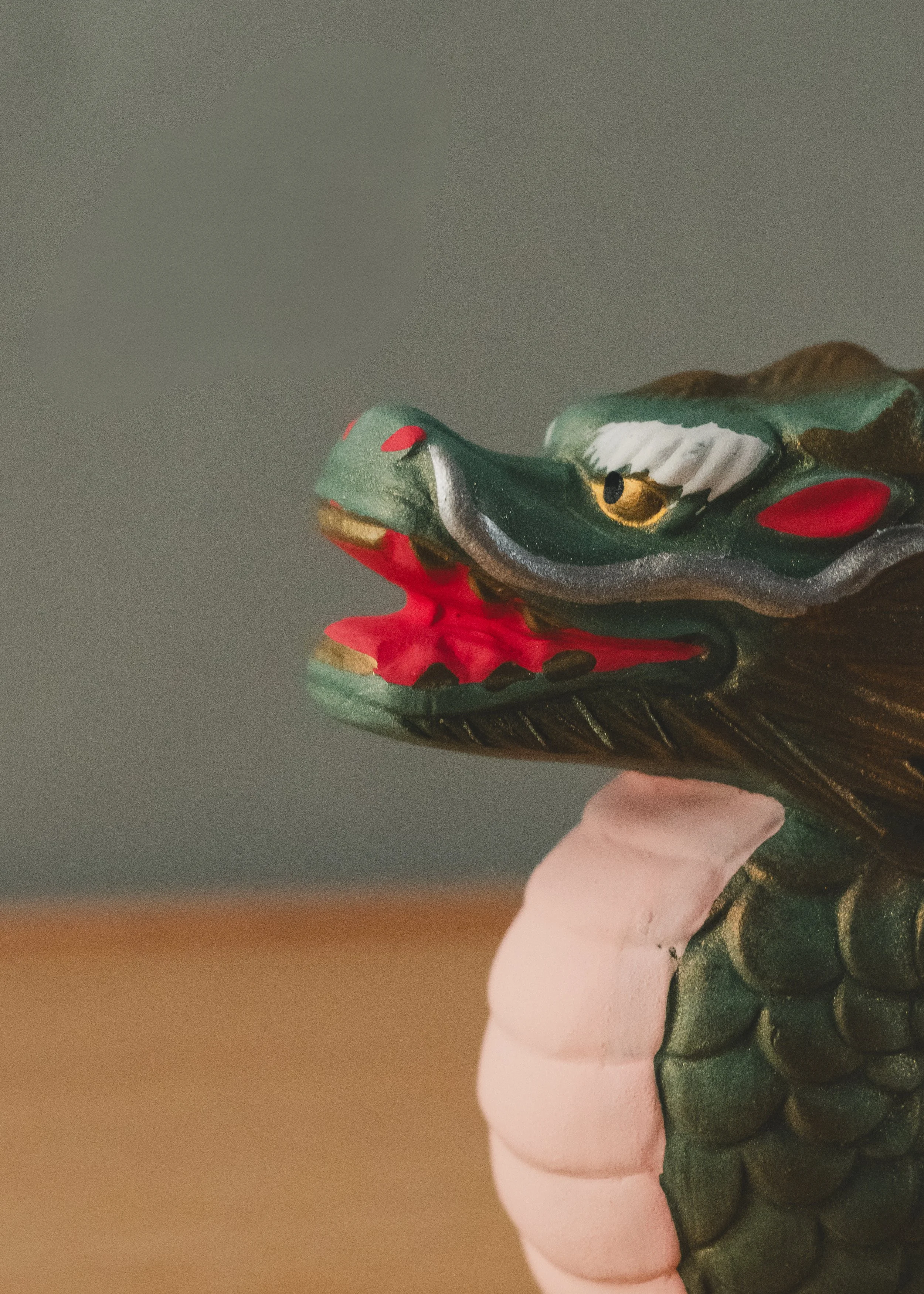 Image 12 of 14
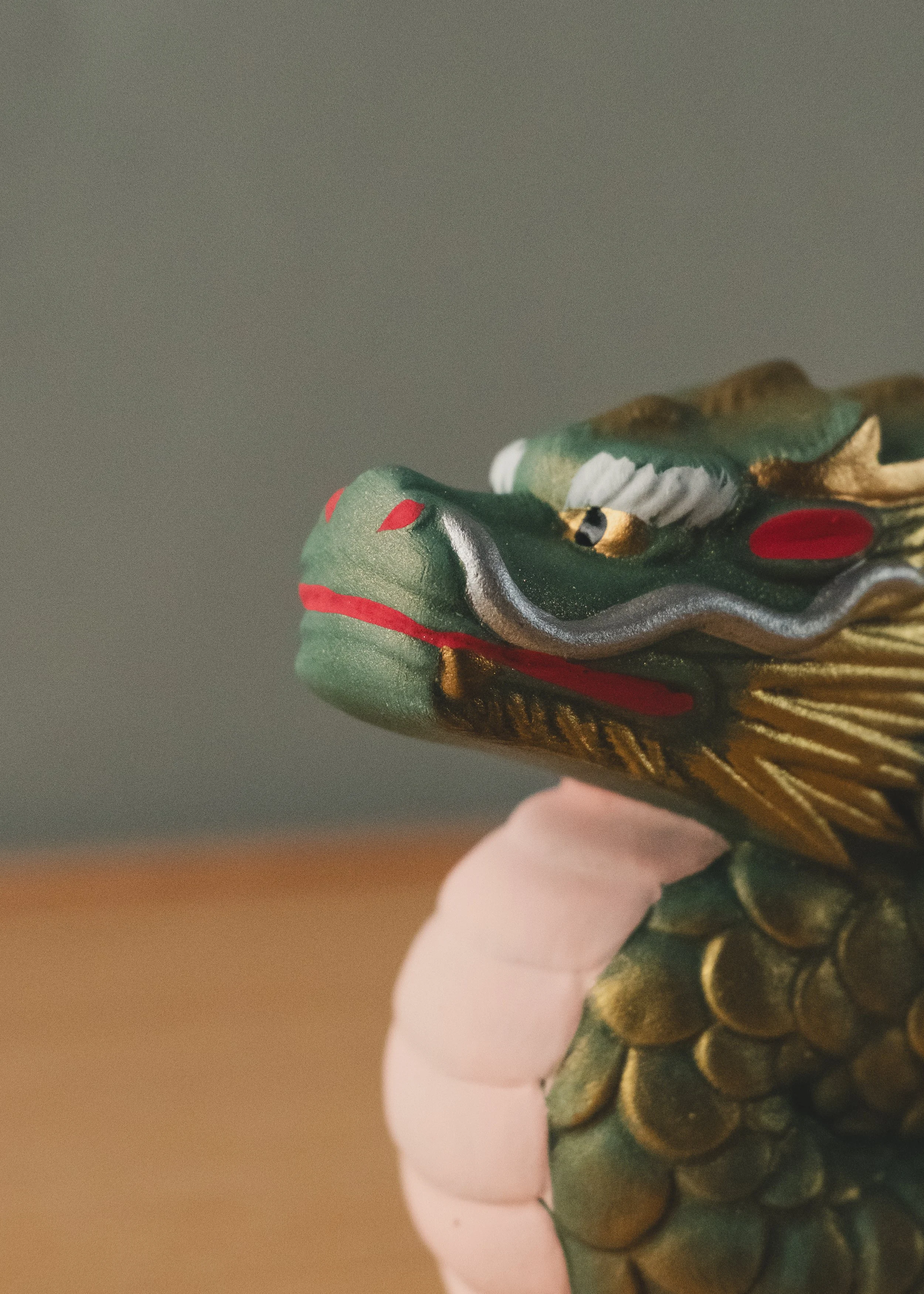 Image 13 of 14
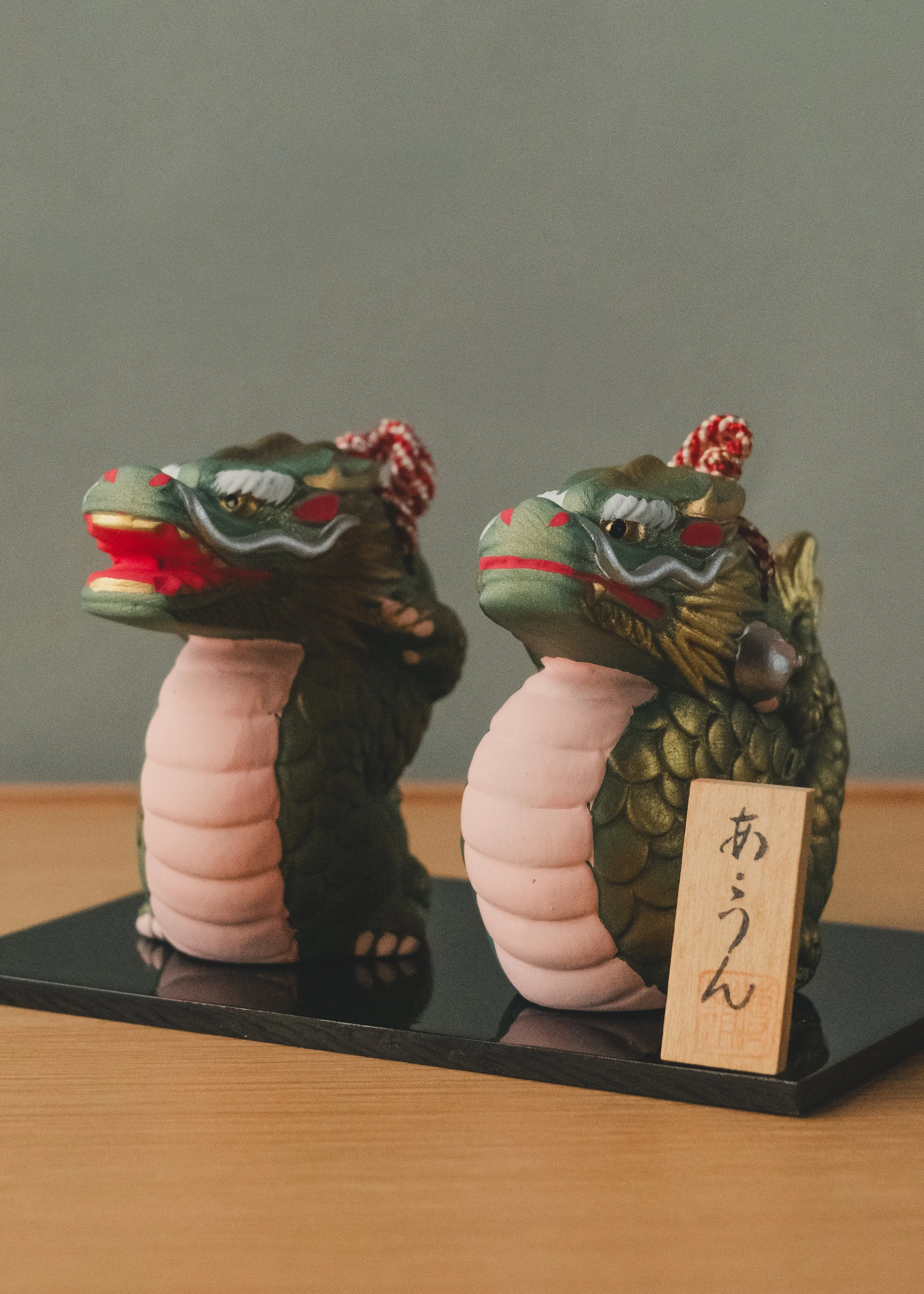 Image 14 of 14
【Context】
Identity: Anonymous Ceramic / Paired Guardian Figures.Origin: Traditional Ceramic Province, Japan.Technique: Glazed Ceramic with Gold Accents and Cord Ornament.Function: Threshold Guardians / Paired Talisman / Contemplative Objects.
【 Dimensions (Approx.) 】
Height: 7 cm (2.8 in) average per figureLength: 8 cm (3.1 in) average per figureWidth: 4 cm (1.6 in) average per figureWeight: 0.054 kg (0.12 lbs) average per figure
RELATED ARCHIVAL SPECIMENS
【 The Concept 】
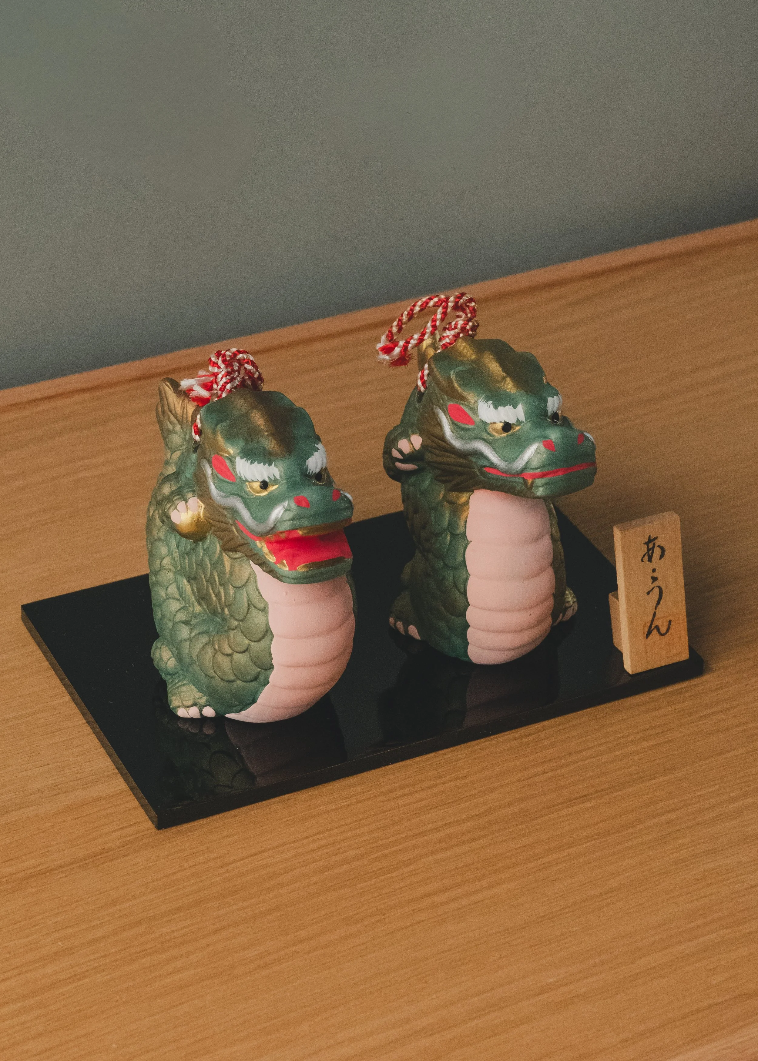
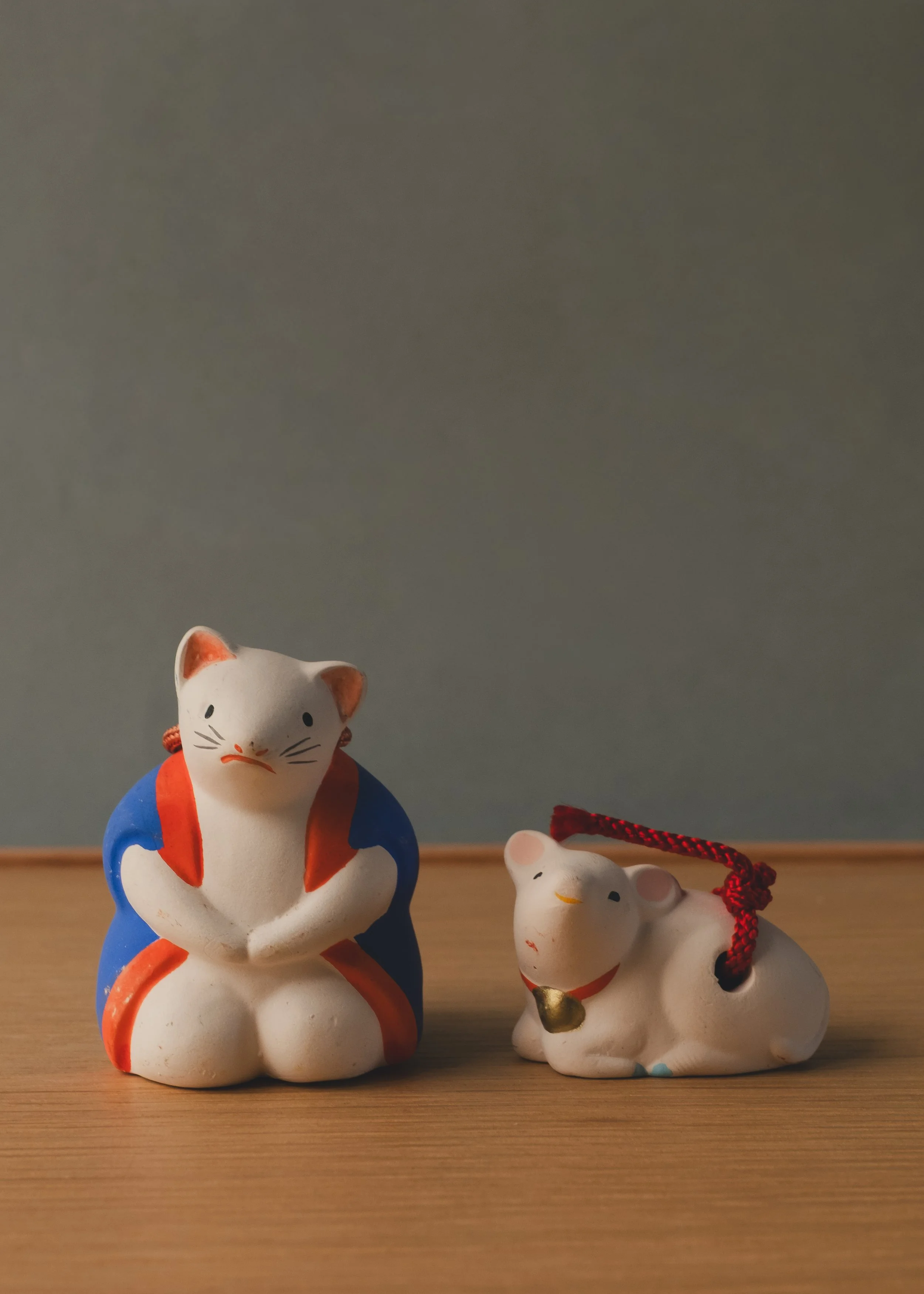
In the Japanese zodiac, the first position belongs to the mouse. Not the dragon, not the tiger — the mouse. The smallest animal in the cycle was given the task of beginning everything. In folk belief, this creature serves a second role: it is the chosen messenger of the god of wealth and harvest. Where the mouse appears, prosperity follows. Where two appear together, the message is twice as certain. An anonymous craftsman in a coastal province understood both roles. They formed two figures from earth — one seated in formal posture, one crouching low as if about to move — dressed them both in red, and placed a clay sphere inside each so that every time they are lifted, a dry rattle sounds from within. The red is not decorative. In Japanese tradition, this color has one purpose: to repel what should not be allowed near.
【 The Function 】
Both figures are dorei — clay bells. Each houses a loose clay sphere that strikes the inner wall when lifted, producing a brief, percussive rattle. In folk practice, this sound served to clear a threshold, a desk, a bedside — any space where misfortune might settle. The larger figure sits upright in ceremonial posture, hands folded. The smaller one crouches forward, alert. Together they create a pair that covers stillness and motion, ceremony and vigilance.
【 The Texture 】
The bodies are white — an unglazed, chalky ground that holds light without reflecting it. Over this, the red garments are painted with a matte mineral pigment that has aged into a warm, uneven tone — darker in the folds, thinner at the edges. The eyes are simple black dots. The whiskers are single brushstrokes. On the back of the larger figure, characters are pressed into the clay before firing — a mark that ties these objects to a specific shrine district in Japan's southern coastal region. The surface is dry, warm, and rough in the way that only unfired earth can be.
【 Presence 】
They are small enough to share a windowsill. The larger one commands attention; the smaller one earns it. Place them together and they become a conversation — one still, one ready. One guarding, one scouting. The rattle is faint, almost private, audible only to the person holding them. That is the point. The protection they offer was never meant to be loud.
Sourced from a private collection in southern coastal Japan.
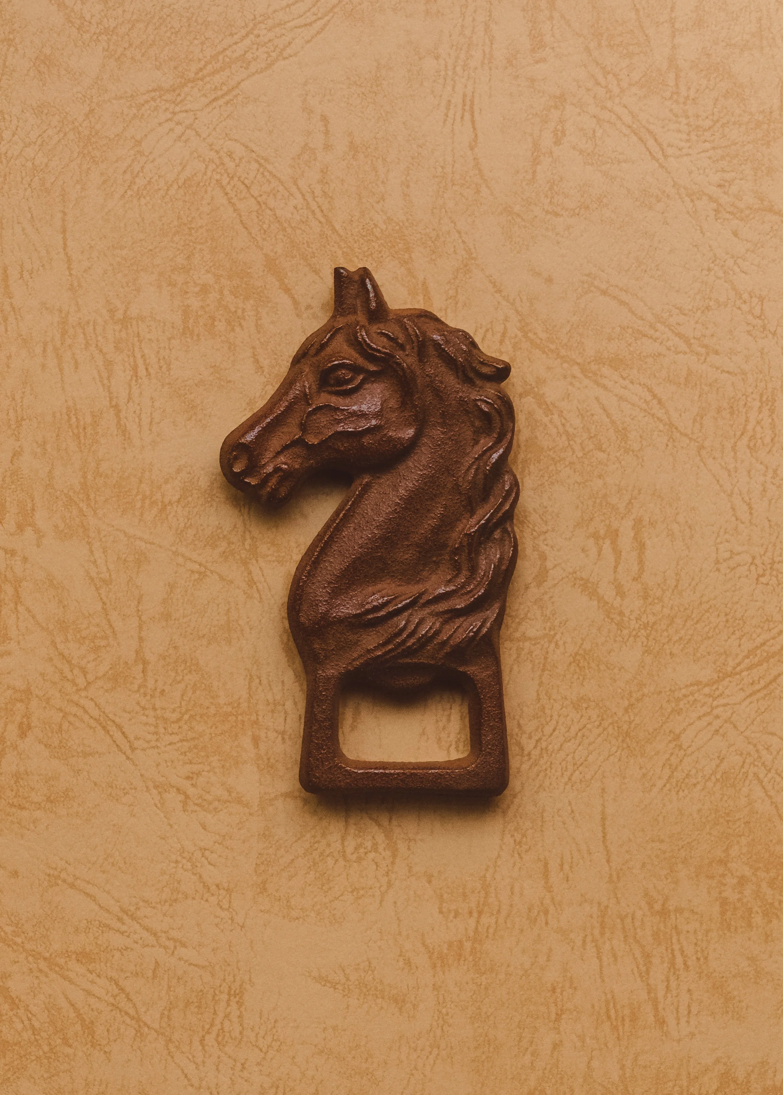
【 The Concept 】
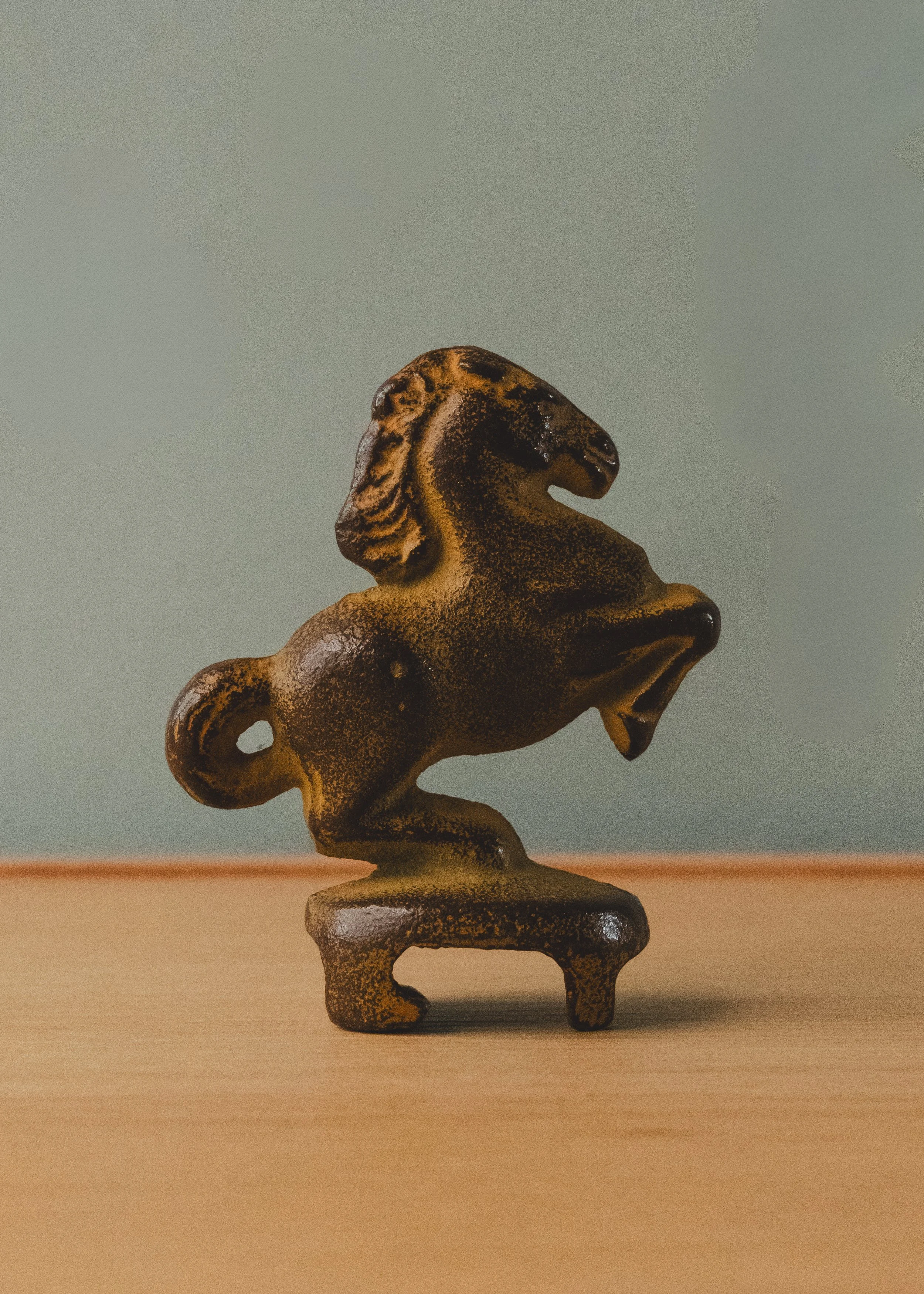
A horse that only moves forward. In Japanese tradition, the horse is the one animal that never retreats — it runs, it leaps, it falls, but it does not step backward. This made it sacred. Temples kept living horses as vessels for carrying prayers to the gods. When living horses became too costly, people carved wooden ones and painted them. When wood was not enough, they cast them in iron. An anonymous ironworker in a northern foundry province made this one mid-leap — front legs raised, weight thrown forward, frozen at the exact moment before landing. Then they carved a notch into its base and turned the whole animal into a bottle opener.
【 The Function 】
A bottle opener. A sculptural object. A paperweight when it is not opening anything — which is most of the time. The base is flat enough to stand upright on any surface without support. The iron is dense enough to hold paper steady in a draft. Between these tasks, it stands on a desk or a shelf and does what rearing horses have always done in this culture: it faces forward and refuses to look back.
【 The Texture 】
Cast iron with an antique bronze-toned finish that has deepened unevenly over decades. The surface carries the grain of the sand mold — a fine roughness that catches light at low angles and disappears under direct illumination. The mane flows backward. The tail is taut. The legs are mid-stride. The face is simplified to a suggestion — two eyes, a flared nostril, and an expression that shifts between determination and calm depending on the angle of approach. At 201 grams, the weight is disproportionate to the size. That is the nature of iron.
【 Presence 】
It is eight centimeters tall — small enough to share a desk with a laptop, large enough to be the first thing a visitor notices. The leap is permanent. The landing never comes. That tension between motion and stillness is what makes it impossible to ignore and unnecessary to explain. Place it near anything that needs momentum.
Sourced from a private collection in northern Japan.
【 The Concept 】
A Horse Forged from the Memory of a Province. In the northern highlands of Japan, the horse was never merely an animal. It was a military asset, a spiritual offering, and the economic backbone of a region that sent its finest cavalry to shape the course of feudal history. This anonymous craftsman understood that inheritance. They distilled nine hundred years of that culture into the palm of the hand — not in clay or wood, but in the uncompromising permanence of cast iron.
The horse stands in profile. Still. Alert. It does not perform. It holds its ground with the quiet authority of something that has outlasted the civilization that created it.
【 The Function 】
Form and Force, Unified. This object was engineered as a bottle opener — but that description fails to account for its true nature. The horse's silhouette is not decoration applied over a tool; it is the tool. The precise geometry of the lower body forms a lever calibrated to engage crown caps with a single, decisive downward motion. The weight of the iron — dense, volcanic, uncompromising — provides the counter-balance. The result is not convenience. It is ceremony.
When not in use, it sits as a paperweight on a desk, a sentinel at the edge of a shelf. The function does not disappear. It simply waits.
【 The Texture 】
The Skin of the Earth, Fired Twice. The surface carries a deep, dark lacquer — applied by hand to heated iron in a process that bonds pigment directly to the metal's grain. The finish is not smooth in the way of manufactured goods; it possesses a subtle texture, a warmth that shifts between charcoal and deep umber depending on the light. Run a thumb across the surface. It resists. It does not flex. It does not yield. This is what iron feels like when it has been made properly.
【 Presence 】
A Counterweight to Everything Disposable. This object has survived decades in a culture that rarely preserves things without function. That it is here, intact, with its original box — is itself a statement. Place it on a raw oak surface or against a concrete wall. It does not decorate the space; it anchors it. It speaks to the person who has grown tired of owning things that weigh nothing and mean less.
Sourced from a private collection in Iwate Prefecture, Northern Japan.