【 The Concept 】
A clenched fist cast in copper-plated metal, flat as a playing card, heavy as a promise. It is a bottle opener. It is also a document. Across both surfaces, the word "victory" is stamped in ten languages and three alphabets — Latin, Cyrillic, and Devanagari — each one paired with a country name in small capitals beneath it. Portugal, Italy, England, the United States, Holland, France, Spain, the Soviet Union, Germany, India, Poland. Some of the spellings are wrong. The Spanish entry uses an Italian word. The German entry misspells its own language. These are not errors that a native speaker would make. They are the fingerprints of an East Asian workshop translating Western languages from a reference list, prioritizing the shape of the letters over their accuracy — and producing, in the process, something more honest than a correct translation would have been.
At the center of the front face, a circular enamel emblem depicts a harbor city: green peaks, white towers, blue water, and a red-sailed junk. The city is not named in the product description. It names itself, in the emblem, in English, in capital letters.
【 The Function 】
111 grams. A flat metal tool shaped like a fist, with a notched opening between the knuckles and the wrist that hooks under a bottle cap and levers it off. To use it, you wrap your own hand around the metal fist and squeeze — gripping a grip, clenching a clench. The physical act mirrors the object's theme: you apply force to something that is already the symbol of force. It works. The cap comes off. The beer is open. The ten nations on the surface have, collectively, won.
【 The Texture 】
Copper-toned metal with an antique wash that darkens the recessed areas and leaves the raised text and knuckles catching light. The finish is not bright copper. It is the color of a penny that has been in a pocket for a decade — warm, reddish-brown, with a matte quality that makes it feel older than it is. The embossed text varies in style from face to face: serif capitals for the English, flowing script for the Italian and Dutch, blackletter gothic for the Spanish and Polish, and hand-drawn Cyrillic and Devanagari that sit slightly unevenly on the surface, as though the die-cutter was working from a photograph rather than a font. The enamel emblem is the only point of color — a small bright window in an otherwise monochrome field of copper and shadow.
【 Presence 】
It is the only object in MINGEI 1926's archive that is designed to be held, used, and put back down. Every other piece is meant to be looked at. This one is meant to be grabbed. It is also the only piece that carries text as its primary visual element — not pattern, not texture, not form, but words. Ten words for the same idea, written in scripts that most of the world cannot read, stamped into a fist that most of the world can understand. The spelling mistakes do not diminish it. They complete it. A perfect translation would have been invisible. These errors make the object visible — they reveal the distance between the workshop that made it and the languages it tried to speak, and that distance is the entire story.
Sourced from a private collection in the Kansai region, Japan.


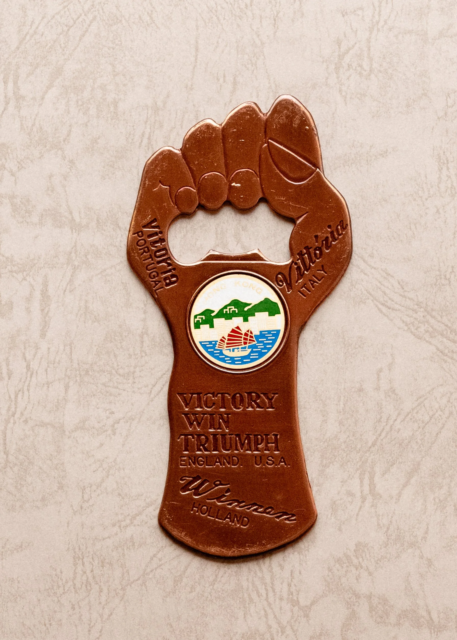 Image 1 of 3
 Image 2 of 3
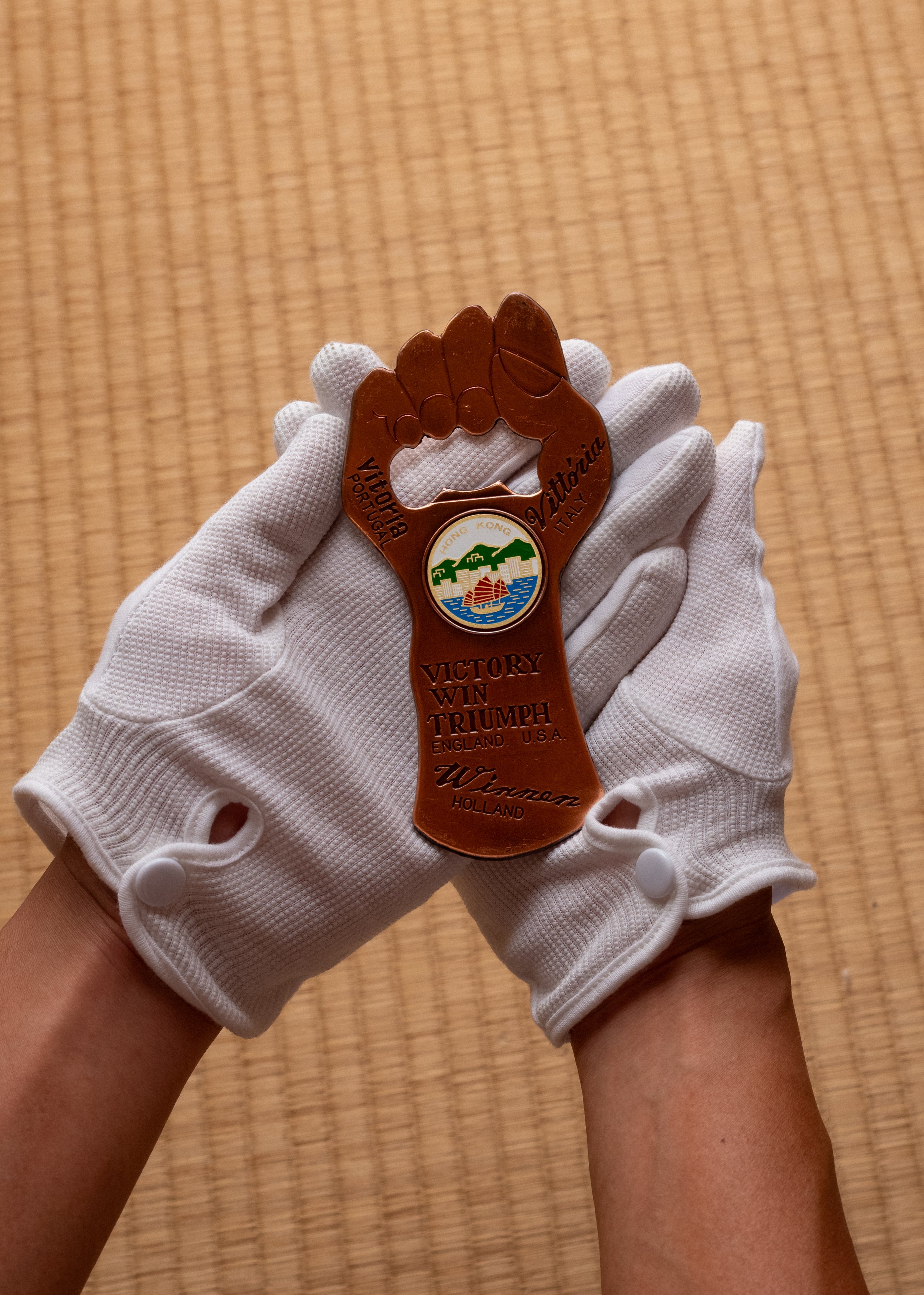 Image 3 of 3